File talk:Internet Censorship and Surveillance World Map.svg
Internet censorship picture[edit]
Hello, I noticed you are the creator of the Internet Censorship map that's being used in wikipedia articles. I was wondering if it'd be possible to change some of the colors on the map. The colors you used, specifically the white, light gray and light pink, are very hard to see. Would it be possible to change these three colors on the map to something that can be seen better? Thanks --Turn685 (talk) 12:03, 2 December 2011 (UTC)
- We can try. Do you have any suggestions for better colors to use? The current revision of the map was among other things a change of colors to try and get away from what some felt were too many sharply contrasting colors. We need seven colors in all (including white). Currently white is used for the oceans and an off-white is used to indicate "selective censorship". If possible the colors used should give a sense of a range from "persuasive" to "no evidence". --W163 (talk) 13:44, 2 December 2011 (UTC)
- The previous version:

- The current version:
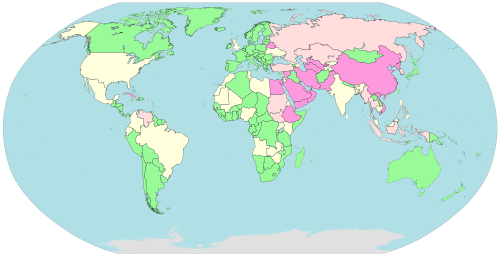
- Pervasive censorship
- Substantial censorship
- Selective censorship
- Under surveillance
- No evidence of censorship
- Not classified / No data


The current version was recently changed to show water in blue (powder blue). Hopefully, that helps the situation a bit. --W163 (talk) 21:54, 24 December 2013 (UTC)
Proposal for a new color scheme[edit]
- I thought the exact same thing as Turn685, and I've taken the liberty of making my own version of this picture:
- https://upload.wikimedia.org/wikipedia/commons/thumb/archive/6/6e/20140111163602%21Internet_Censorship_World_Map_suggested.svg/500px-Internet_Censorship_World_Map_suggested.svg.png
- This uses the following colour codes:
- F55: Pervasive censorship
- FA5: Substantial censorship
- FE5: Selective censorship
- A6F: Under surveillance / Changing situation
- 0A0: No evidence of censorship
- AAA: Not classified / No data
- To me it seems like those would be much more natural colours to represent this. It labels the countries in a kind of order from worst to best. The purple is because the situation is changing there, so it's neither good nor bad. Purple stands out from other colours, which makes it a good choice for representing this in my opinion. The grey is a clear indicator of the fact the state is not known for those countries.
- I'll check this talk page again tomorrow, and I'll go ahead and change all of the legends for this image if you don't object.
- I'm posting this message to give you the chance to have your say in this before I change every page that has this file on it, because it'd just be wasted effort to do all that twice.
- Joeytje50 (talk) 01:54, 11 January 2014 (UTC)
- The current colors are now used in a number of other places, so this change would be a bigger one than you might expect. See en:Censorship by country, en:Freedom of the Press (report), en:Press Freedom Index, File:FreedomHouse-FreedomOfThePress-WorldMap.svg, and File:RWB-PressFreedomIndex2013-WorldMap.svg, in addition to File:Internet Censorship and Surveillance World Map.svg. I'm pretty happy with the current colors, particularly since the relatively recent change to show water as light blue. I think the change to blue should have addressed User:Turn685's original concern. When I made my original changes to the colors being used back in September 2011, one of the things I did was move away from very bright primary colors. Your changes move things back in the other direction. I just think that colors like red have too many implicit associations connected with them and so think they should be avoided for the purposes here. So, I guess I'm not in favor of the proposed color change. If you think it is important to make it, we should probably try to get the opinions of a few other editors. I do think using a black border rather than a white boarder around more or all countries would be a good change to make. --Jeff Ogden, aka W163 (talk) 06:06, 11 January 2014 (UTC)
- I didn't know about those other images. My problem with the current image though, is that the difference between "Substantial censorship", "Selective censorship" and "No data" is so incredibly tiny. I personally don't really have the best of monitors, so that will probably be part of the reason this image is really hard to distinguish the colours in, but also a large part of the problem would be that those 3 colours only change from #FFDDDD -> #FFFFDD -> #E0E0E0. That means that each of the the largest difference in colour would be between #FFFFDD and #E0E0E0, which would be a difference of rgb(-31, -31, +3). That is still a tiny difference, and hard to distinguish, especially on older monitors (for which it should still be just as easily distinguishable; Wikipedia should be easy enough to read even if you don't have the best of monitors). Just to show you what it looks like on my monitor, here is a photo of my monitor. I also tried viewing the image on my phone (which has a better screen), and I can see the colours are indeed distinguishable enough there, but on older screens like mine it's just really hard to. But, perhaps these colours would be better for you too:

- The current colors are now used in a number of other places, so this change would be a bigger one than you might expect. See en:Censorship by country, en:Freedom of the Press (report), en:Press Freedom Index, File:FreedomHouse-FreedomOfThePress-WorldMap.svg, and File:RWB-PressFreedomIndex2013-WorldMap.svg, in addition to File:Internet Censorship and Surveillance World Map.svg. I'm pretty happy with the current colors, particularly since the relatively recent change to show water as light blue. I think the change to blue should have addressed User:Turn685's original concern. When I made my original changes to the colors being used back in September 2011, one of the things I did was move away from very bright primary colors. Your changes move things back in the other direction. I just think that colors like red have too many implicit associations connected with them and so think they should be avoided for the purposes here. So, I guess I'm not in favor of the proposed color change. If you think it is important to make it, we should probably try to get the opinions of a few other editors. I do think using a black border rather than a white boarder around more or all countries would be a good change to make. --Jeff Ogden, aka W163 (talk) 06:06, 11 January 2014 (UTC)

- F77: Pervasive censorship
- FB5: Substantial censorship
- FF9: Selective censorship
- B9D: Under surveillance / Changing situation
- 7D7: No evidence of censorship
- AAA: Not classified / No data
- I've changed the colours to more toned down pastel colours. They are still clearly distinguishable per country, but not as bright as the previous version.
- Besides, what's so bad about the associations people have with red-green "gradation"? Isn't that exactly what this image is for? It's "grading" the countries by censorship, in a bunch of different categories. Red is commonly associated with the "worst", and in this image that is indeed what it shows: red means that the country has the worst censorship, then orange means less censorship, etc.
- If you think red shouldn't be used because that has a kind of "negative association", then you should probably not use the word "pervasive" either, since that has a negative association with it too. What I'm trying to say is that I don't think there would be any problem with a red-green gradation.
- Just to cite some other examples, the first couple of labelled maps I found by just randomly going by anything I could think of: File:Privacy International 2007 privacy ranking map.png, File:Wealth gini 2013 .svg, File:Mort.svg, File:Corporal punishment in Europe.svg, File:Prostitution laws of the world.svg, and File:Malaria world map - DALY - WHO2002.svg. I just kept searching for more images until I finally found one that did not go from red to green, and the first image I found that did not, even went from red to yellow. It seems like almost every single labelled map for either quality of life, or presence of something, is labelled in a red-green kind of way. I did not filter out any images that would have shown otherwise from my findings, these are the actual first 6 coloured maps I found on Wikipedia.
- PS: I am willing to update all those images and pages if it's not a huge list of 100 pages per image or something. A simple find&replace will handle all the pages' contents too, so that's not a very big problem.Joeytje50 (talk) 17:10, 11 January 2014 (UTC)
- I like the toned down colors you propose better. I'd still like to get some comments from other editors to see what they think. I'll put some comments on some of the talk pages of the articles that use these colors back on the English Wikipedia to see if we can get some interest.
- One thing to try is to see how the proposed colors look when used in a list rather than a map. It was with lists that I found the pre-September 2011 colors to be most hard or unpleasant to read.
- You can use the "What links here" option from the "Tools" sidebar to get a feel for how many articles would need to be updated for each image. There will be a few pages that use the images in the non-English versions of Wikipedia too.
- My problem with the implicit associations are things like "green" for good and go or "red" and "pink" for communist, stop, or fire. I don't have any problem with the word "pervasive" because that is the term that is used by the en:OpenNet Initiative. "Pervasive" doesn't imply anything negative alone. Pervasive happiness would be considered a good thing by most folks. Pervasive hunger has a different implication for many. What we need is a color that implies pervasive and not much else, but I'm not sure that such a color exists. So, we make do with what we have.
- --Jeff Ogden, aka W163 (talk) 21:01, 11 January 2014 (UTC)
(tab reset) Here's a demo of what it'd look like in a table format:
| Pervasive censorship | Substantial censorship | Selective censorship | Changing situation | No censorship | No data | |
|---|---|---|---|---|---|---|
| Current colours | Lorem | Ipsum | Dolor | Sit | Amet | Consectetur |
| First proposal | Lorem | Ipsum | Dolor | Sit | Amet | Consectetur |
| Second proposal | Lorem | Ipsum | Dolor | Sit | Amet | Consectetur |
It seems to me that the second proposal colours pretty well readable, probably because the colours are pastel colours. The first proposal colours would work too, but I do agree that the toned down colours are better.Joeytje50 (talk) 02:10, 12 January 2014 (UTC)
- Thanks for entering the example table above. I took the liberty of editing it to add a new row showing the colors used in the current version of the map and to change the row labels to make it clear which is which. --Jeff Ogden, aka W163 (talk) 16:46, 12 January 2014 (UTC)
- I'll try to work up an example using one of the existing articles that uses the colors. Looking at the examples here is a little like looking at paint swatch samples and trying to imagine what an entire room painted with the colors would look like. Some people are good at that, but I'm not one of them. --Jeff Ogden, W163 (talk) 16:46, 12 January 2014 (UTC)
- OK, follow this link: https://en.wikipedia.org/wiki/Special:TemplateSandbox?prefix=User%3AW163%2Fsandbox&page=User%3AW163%2Fsandbox%2FCensorship+by+country&revid=&text= to see the en:Censorship by country article rendered with the new colors (second "toned down" proposal). --Jeff Ogden, aka W163 (talk) 23:30, 12 January 2014 (UTC)
- There seems to be no response from any others. Should I go ahead and make this change, or do you want to wait for others to respond?Joeytje50 (talk) 14:09, 14 January 2014 (UTC)
- Lets wait a bit. I'm not entirely comfortable with the way the new colors look on the en:Censorship by country and other similar articles. And I'm not sure that the change offers a big enough improvement to justify all of the work that will need to be done to put it into place everywhere. I'd like to hear from others to see what they think. If we don't get strong support from others, I don't think we should make the change to the new color scheme. --Jeff Ogden, aka W163 (talk) 01:55, 15 January 2014 (UTC)
- W163 and Jeff, I like the second proposal. Personally, I find the pastels easy to distinguish and readily understandable. I am curious, do you know if there are any usability/accessibility tests that we can run on the colors to make sure that there is sufficient contrast? Slaporte (talk) 22:07, 14 December 2014 (UTC)
- Lets wait a bit. I'm not entirely comfortable with the way the new colors look on the en:Censorship by country and other similar articles. And I'm not sure that the change offers a big enough improvement to justify all of the work that will need to be done to put it into place everywhere. I'd like to hear from others to see what they think. If we don't get strong support from others, I don't think we should make the change to the new color scheme. --Jeff Ogden, aka W163 (talk) 01:55, 15 January 2014 (UTC)
Are small island countries harder to see?[edit]
Has the map itself changed? In the water-is-white map, a lot of small island countries are visible that are not visible in the water-is-blue map. Have those countries been scaled down/removed, or are they just nearly impossible to see because of the blue water? If the latter, I think changing the water to white or light grey or something would be appropriate, if the former, maybe we should try and add them back in? 98.198.203.82 20:16, 8 February 2014 (UTC)
- Not sure. Which map is the water-is-white map you are looking at? The one shown as an example above is a different map (File:Internet blackholes.svg). That map was replaced with a new updated map in September 2011 that used a different color scheme, but still showed water-as-white (File:Internet Censorship and Surveillance World Map.svg). And the water color of that map was changed to sky blue in December 2013. If you click on the maps, you'll get a somewhat larger version to look at. And if you click on the map again you'll get a version that you can usually enlarge further using controls in most web browsers. Take a look and see how the different maps compare. To my eye the small island countries are a little easier to see on the the current water-is-blue map than on the water-is-white maps from September 2011 to November 2013. But that could just be me.
- Countries that haven't been classified are shown in gray. When a country is classified, the color changes and for the smallest countries a small circle is used to make them a little easier to see. I've been slowly working my way through the unclassified countries and when there is enough information available from a reliable source, I've been adding them to the en:Internet censorship by country article and updating the current map. I'm pretty much finished with the larger countries, but haven't gotten to most of the smaller island countries. I hope to do that over time. When it is done, those small countries should be more visible. Or we could go ahead and make them more visible now, but they would still be shown as unclassified (gray). Thoughts? --W163 (talk) 17:01, 13 February 2014 (UTC)
Indonesia[edit]
Is it possible to add Indonesia to Pervasive Censorship...the country is going backwards...not forwards? Miguetlastra (talk) 09:17, 1 May 2012 (UTC)
- Probably not. The classifications are based on information from the article Wikipedia:Internet censorship by country which in turn uses the classifications from the OpenNet Initiative, Reporters without Borders, and other similar organizations. So to change Indonesia, one of those organizations would need to change their classification. If one of those organizations does change their classification, we will update the map accordingly. --W163 (talk) 03:06, 30 June 2012 (UTC)
Korea[edit]
North Korea same as South Korea? --Itu (talk) 21:21, 22 November 2012 (UTC)
- Perhaps not the same, but in the same category (Pervasive censorship). See the article en:Internet censorship by country for more information. --W163 (talk) 06:39, 15 December 2012 (UTC)
Japan, Legend[edit]
Some type of legend that details what each section (pervasive, selective, etc. ) means should be added. Otherwise its not exactly clear what each section entails. Also, under what grounds is Japan "little to no censorship"? Doesnt their drawn/loli censorship(where genitals in hentai have to be mosaiced over) kind of count as strict? I guess these types of laws are too complex to be summarized in a table like this...
- The description for this image/map says: "A map showing the level of Internet censorship by country throughout the world. Based on Wikipedia:Internet censorship by country and Wikipedia:Censorship by country." Those articles define what the various categories mean. The name of the second article has been changed to Wikipedia:Internet censorship and surveillance by country. -Jeff Ogden (W163 (talk) 18:52, 31 March 2015 (UTC))
Request new image to reflect updated list[edit]
This image is out of date again. The status of some countries has changed in the Wikipedia:Censorship by country page as a result of focusing on censorship, rather than both censorship and surveillance. It would be appreciated if someone could update this image (Internet Censorship World Map) to reflect the updated list. Mamyles (talk) 21:38, 20 January 2015 (UTC)
- Some data was deleted from the Wikipedia:Censorship by country article, but I don't think that that by itself changed the classification of any of the countries. Wikipedia:Censorship by country is the more general article. This map is more based on the Wikipedia:Internet censorship and surveillance by country article, which is specific to the Internet. That article has not changed and deals with both censorship and surveillance. My personal feeling is that it is very difficult to deal with Internet censorship or Internet surveillance alone and having a map based on both is appropriate.
- I'm not entirely comfortable with the changes that were made to the Wikipedia:Censorship by country article, but they were made a few months ago when I wasn't paying close attention. I'll try to deal with that elsewhere when I get some time.
- -Jeff Ogden (W163 (talk) 20:25, 31 March 2015 (UTC)).
- If this map does not reflect the classifications in the current version of the Wikipedia:Internet censorship and surveillance by country article, then that calls for an update. I'll try to check the map against the article when I have some time. Others should feel free to make any required updates, if they get to it before I do. -Jeff Ogden (W163 (talk) 20:25, 31 March 2015 (UTC)).
- I checked and the map seems to accurately reflect the classifications from en:Internet censorship and surveillance by country, so no update is required right now. --Jeff Ogden, W163 (talk) 15:26, 23 April 2015 (UTC).
United States[edit]
I see that the color of the US was changed to "Pervasive censorship". Is this because the US was added to RWB's "Enemies of the Internet" list? Perhaps I'm biased as a US resident but to me it just feels wrong and very misleading, as it puts the US on the same level as China and North Korea. (Also, I am pretty sure that the US was added to the list due to surveillance, not censorship.) Bclam32 (talk)
- I think you are right that the US was put on RWB's "Enemies of the Internet" list mostly because of its surveillance practices.
- This map summarizes the classifications in the en:Internet censorship and surveillance by country article and that article is mainly based on the en:OpenNet Initiative classifications and the RWB lists. So, while it may feel wrong to some to have the US classified the same as China or North Korea, in order to change the map we'd need change the "Internet censorship and surveillance" article and to change that article RWB would need to remove the US from their Enemies list. I'm guessing that someone from China or North Korea might feel that because of its surveillance practices the US is an "Enemy of the Internet". I might agree with them.
- Having said all of the above, the sources being used for the "Internet censorship and surveillance" article are likely to be changing in the future. See the discussion at en:Talk:Internet censorship and surveillance by country#Main sources for this article going away, what should be done? for more about this and to join into the discussion.
- --Jeff Ogden, W163 (talk) 22:05, 11 April 2015 (UTC).
Creating another image that only depicts censorship[edit]
@W163: This image was renamed from "Internet Censorship World Map.svg" to "Internet Censorship and Surveillance World Map.svg" a few weeks ago. You're right that in its current renamed form, it would not be appropriate to remove those countries. Would it be possible for you to create another image that only depicts censorship, like what there was before? It would be used in articles that discuss censorship exclusively, such as w:Censorship by country and w:Internet censorship. Mamyles (talk) 14:28, 20 April 2015 (UTC)
- What would the new map be based upon? The current map is based upon the classifications in en:Internet censorship and surveillance by country article. We'd need a similar list of countries that deals only with Internet censorship and omits issues such as surveillance and access. And for that we'd need reliable sources to cite in the article. I'm not aware of such an article or other good comprehensive sources, but if someone can recommend some, then a new article or map could be created. As mentioned above there is a discussion over at en:Talk:Internet censorship and surveillance by country#Main sources for this article going away, what should be done? that is trying to figure out what to do now that the two main sources used in the article (the RWB Internet Enemies list and the ONI classifications) are no longer being updated regularly. Please join that discussion and help figure out what we should do. --Jeff Ogden, W163 (talk) 19:07, 20 April 2015 (UTC)
- The current map is based on en:Censorship by country as it was before October 20th, when I removed surveillance-related columns. The current map was named "Internet Censorship World Map" until three weeks ago. The new map would be based on en:Censorship by country, just as this one was before the rename. The ONI classifications going away are something to consider going into 2016, but a map depicting censorship would still be useful in 2015-2016. Mamyles (talk) 21:36, 20 April 2015 (UTC)
- @Mamyles: No, the current map was and is based on the classifications in the en:Internet censorship and surveillance by country article. The classifications in that article are in turn based on the classifications and ratings from both the en:OpenNet Initiative (ONI) and en:Reporters Without Borders (RWB) and when a country has not been classified by ONI or RWB, the reports from Freedom House and in the U.S. State Department Bureau of Democracy, Human Rights, and Labor's Human Rights Reports are used. After the Internet lists from RWB and Freedom House (FOTN) were deleted back in October 2014, only the ONI classifications are included in the en:Censorship by country article. And while one of the lists deleted last October focused primarily on surveillance, the others dealt with both censorship and surveillance and I'm not sure why they needed to be deleted.
- Renaming the map file did not change anything about the map or what it is based on. All the renaming did was give a better name for the file that helps make it clearer what the map shows. And the file name isn't all that important since most readers never see the file name. It is the caption and legend on the map that tell a fuller story. Over the course of the past few years surveillance has taken on a larger role in the Internet censorship and surveillance by country article (the article was renamed from "Internet censorship by country" to "Internet censorship and surveillance by country" in July 2014), in the sources used in that article, and in the map, but censorship remains important too. A number of recent changes were made to the article and the map caption and legend to, hopefully, improve the explanations so they do a better job of acknowledging that shift.
- Censorship by country displays the individual rankings and classifications that are available for a country, but does not consolidate them into a single classification for a country as is required for the map. The Internet censorship and surveillance by country article does consolidate the rankings and classifications into a single classification for a country (and explains how that is done).
- So the question remains, where would someone go to get a list of country classifications on the level of Internet censorship? Would the map only include classifications for the 77 countries classified by ONI (there are 167 countries classified on the current map)? How would you show countries such as Cuba and North Korea that are classified as "no data" by ONI? If we are just using the ONI classifications, why not just use the maps from ONI (they are freely available under a Creative Commons Attribution License)? Is there really a need to create our own map, if it is based on a single source?
- --Jeff Ogden, W163 (talk) 03:06, 21 April 2015 (UTC).
- Inclusion on those RWB lists no longer indicate the level of internet censorship. The two lists now indicate only whether censorship or surveillance is present. The meaning of the lists in regard to censorship is entirely lost, and inclusion would only serve to inaccurately portray some countries as conducting censorship when they clearly do not. For example, take the United States, with the least amount of internet censorship in the world due to w:First amendment. The USA does not censor anything, even criminal content.
- As such, the two RWB lists are only appropriate for inclusion on a list or map that depicts both internet censorship and surveillance. They should not be included on any list or article that discusses the topics in isolation.
- So the question remains, where would someone go to get a list of country classifications on the level of Internet censorship? Would the map only include classifications for the 77 countries classified by ONI (there are 167 countries classified on the current map)? How would you show countries such as Cuba and North Korea that are classified as "no data" by ONI? If we are just using the ONI classifications, why not just use the maps from ONI (they are freely available under a Creative Commons Attribution License)? Is there really a need to create our own map, if it is based on a single source?
- My request here was to fix the map when it was named Internet Censorship World Map, as it was clearly incorrectly depicting some countries as conducting censorship when they were not. Since the rename will not be reverted, consider this request dropped. A new world map will need to be generated or found that discusses censorship in isolation, so that it can be included in articles such as w:Internet censorship, w:Censorship, and w:Censorship by country. Mamyles (talk) 16:04, 23 April 2015 (UTC)
- I think we agree. This is what I wrote a few days ago:
- The current map is based upon the classifications in en:Internet censorship and surveillance by country article. We'd need a similar list of countries that deals only with Internet censorship and omits issues such as surveillance and access. And for that we'd need reliable sources to cite in the article. I'm not aware of such an article or other good comprehensive sources, but if someone can recommend some, then a new article or map could be created.
- So the next step is for someone to locate some reliable comprehensive sources that just deal with censorship and which can be used to create a new map. I'm not sure if you want a map about censorship in general or one that is about Internet censorship. Either or both would be good additions, if appropriate sources can be found. If the goal is a general article, the Freedom House Freedom of the Press report and Reporters Without Borders Press freedom index might be enough to generate a new map. If those are the sources that are used, you might want to call the new map "Freedom of the Press by country" rather than "Censorship by country". --Jeff Ogden, W163 (talk) 16:57, 23 April 2015 (UTC).
- I think we agree. This is what I wrote a few days ago:
How to create a new "by country" map[edit]
Keeping in mind what I wrote about creating a new map above, technically it isn't hard to create a new map. You don't need any graphics experience or fancy software. The "by country" map is an SVG file, which is a text file that can be edited with any text editor. Most web browsers will load and display an SVG file, so you can proofread your new map that way before you upload it to the WikiMedia Commons.
I'd start by downloading a copy of the existing File:Internet Censorship and Surveillance World Map.svg file to use as a template, give it a new name, and edit the file to update the several style sections near the top of the file so they list the countries you want to be in each category. That is pretty much it.
You want to be sure that a country doesn't appear in more than one category since you'll get no error or warning about that and the resulting map may not show what you want.
Perhaps the hardest part of all of this is figuring out the two letter country codes that are used as labels in the style sections. There are comments in the existing map's SVG file that should help with that.
You can change colors easily, see the en:Web colors Wikipedia article for a list.
More information is available from Help:SVG. Good luck.
- --Jeff Ogden, W163 (talk) 23:25, 22 April 2015 (UTC).
US and UK[edit]
In the article Internet censorship and surveillance by country, the United Kingdom and the United States are listed under the "Selective censorship or surveillance" section. On this map, both countries are colored in bright pink for "Pervasive censorship or surveillance". Which one is accurate? Are either or both of them out of date? Thanks in advance for your attention. --Reschultzed (talk) 02:26, 6 August 2016 (UTC)
- The map hadn't been updated since 2014 and so was out of date with respect to the article. I'm updating it now. It will take a day or two. --Jeff Ogden, W163 (talk) 02:50, 28 March 2018 (UTC)
 Done. The map was updated on March 28, 2018 to match the summary classifications from the recently updated Internet censorship by country article. The classifications for the US and the UK changed as did many other countries. --Jeff Ogden, W163 (talk) 11:26, 30 March 2018 (UTC)