Commons:Featured picture candidates/File:Monografie de la Cathedrale de Chartres - 11 Porche du midi - Lithography.jpg
Jump to navigation
Jump to search

File:Monografie de la Cathedrale de Chartres - 11 Porche du midi - Lithography.jpg[edit]
![]() I withdraw my nomination
Voting period is over. Please don't add any new votes.Voting period ends on 17 Feb 2015 at 20:50:42 (UTC)
I withdraw my nomination
Voting period is over. Please don't add any new votes.Voting period ends on 17 Feb 2015 at 20:50:42 (UTC)
Visit the nomination page to add or modify image notes.

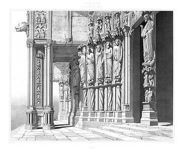
 Info all by Hubertl The south entrance of the cathedral of Chartres, large format scan of an original lithography made in 1867. Original size 60x90 cm. The owner of this lithography (from a series of 70 sheets up to 90x120cm) is the Austrian national heritage Foundation (Bundesdenkmalamt)
 Support -- Hubertl (talk) 20:50, 8 February 2015 (UTC)
- Support --Kreuzschnabel 10:43, 9 February 2015 (UTC)
- Support --LivioAndronico talk 16:52, 9 February 2015 (UTC)
- Support --Uoaei1 (talk) 18:38, 9 February 2015 (UTC)
 Question Could you upload the unprocessed original scan for comparison? Regards, Christoph Braun (talk) 18:00, 10 February 2015 (UTC)
 Comment I could, Christoph, but there is no difference. I didn´t made any changes (no sharpening, no tone curves, nothing), I just repaired some small spots outside the lithograpy itself. The original Tiff has about 500 MB. --Hubertl (talk) 18:54, 10 February 2015 (UTC)
- Well that's rather unfortunate. I was looking forward to see some detail in the lithography's texture as well as its original colour - similar to this. Changing the histogram reveals several brush strokes and rectangular shapes at the image's left side and around its borders as you mentioned. Regards, Christoph Braun (talk) 22:22, 10 February 2015 (UTC)
- What you see is the original color. Apparently, it is important to know which paper was used on the one hand, on the other hand, if the print was exposed to UV light. I think that this was not the case in this instance. The same here--Hubertl (talk) 23:10, 10 February 2015 (UTC)
- I downloaded now the Senefeld-picture, but this is not a lithography, it´s a photo/heliogravure! Like this one. The techniques are "slightly" different Christoph! ;-) Um es konkret zu sagen: Das eine hat mit dem anderen absolut nichts zu tun. Obiges ist eine Zeichnung, welche per Stahlgravur in einen Lithostein übertragen wurde, eine Heliogravur hat als Grundlage eine echte Fotografie, mit der dann die ersten Druckplatten (auf Glas!) hergestellt wurden, mit dem Nachteil, dass es eine Auflagenbegrenzung von 500 Drucken gab. --Hubertl (talk) 23:33, 10 February 2015 (UTC)
- Hubertl, I doubt that pure digital white with no visible paper texture whatsoever is the original colour of your source material. As for the Senefeld image: it's a lithograph created by Major & Knapp in 1871. Here's the same lithograph from bostonathenaeum.org. If you chose to challenge their metadata, then that's your prerogative. There's a huge variety of other lithographs like this one, that one or that one or these other +1600 (including chromalithographs). Maybe the BDA lithographs are impervious to the ravages of time and in pristine condition (unlike some of the LoC lithographs), but even then the paper would have a different colour than digital white and any type of visible texture. Eventually one has to go to the BDA to see the real deal for himself. Either way - without the original scan of your edit, I don't think I can return a fair verdict for your nomination. Regards, Christoph Braun (talk) 15:29, 12 February 2015 (UTC)
- I downloaded now the Senefeld-picture, but this is not a lithography, it´s a photo/heliogravure! Like this one. The techniques are "slightly" different Christoph! ;-) Um es konkret zu sagen: Das eine hat mit dem anderen absolut nichts zu tun. Obiges ist eine Zeichnung, welche per Stahlgravur in einen Lithostein übertragen wurde, eine Heliogravur hat als Grundlage eine echte Fotografie, mit der dann die ersten Druckplatten (auf Glas!) hergestellt wurden, mit dem Nachteil, dass es eine Auflagenbegrenzung von 500 Drucken gab. --Hubertl (talk) 23:33, 10 February 2015 (UTC)
- What you see is the original color. Apparently, it is important to know which paper was used on the one hand, on the other hand, if the print was exposed to UV light. I think that this was not the case in this instance. The same here--Hubertl (talk) 23:10, 10 February 2015 (UTC)
- Well that's rather unfortunate. I was looking forward to see some detail in the lithography's texture as well as its original colour - similar to this. Changing the histogram reveals several brush strokes and rectangular shapes at the image's left side and around its borders as you mentioned. Regards, Christoph Braun (talk) 22:22, 10 February 2015 (UTC)
Ich ziehe meine Nominierung zurück. Ich habe aktuell weder die Zeit noch die Lust hier das Werk zu verteidigen.--Hubertl (talk) 18:46, 12 February 2015 (UTC)