Commons:Featured picture candidates/File:Correios Building, São Paulo, Brazil.jpg
Jump to navigation
Jump to search

File:Correios Building, São Paulo, Brazil.jpg, featured[edit]
Voting period is over. Please don't add any new votes.Voting period ends on 21 Oct 2016 at 22:12:56 (UTC)
Visit the nomination page to add or modify image notes.

- Category: Commons:Featured pictures/Places/Architecture#Brazil
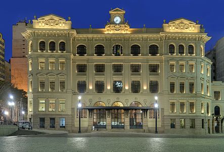
 Info Correios Building, São Paulo, Brazil. Note: Left side is a little different, is not an perspective error -- The Photographer 22:12, 12 October 2016 (UTC)
 Support 😄 ArionEstar 😜 (talk) 23:08, 12 October 2016 (UTC)
- Weak Support. The crop on at the top and right are a bit tight, but still FP for me. --King of ♥ ♦ ♣ ♠ 00:20, 13 October 2016 (UTC)
- Support lNeverCry 01:11, 13 October 2016 (UTC)
- Moderate Support - The building is beautiful, and the VW bug and people hanging out on the left side are a distraction, but it's 7:40 PM in a city, so that goes with the territory and doesn't ruin the picture for me. -- Ikan Kekek (talk) 03:07, 13 October 2016 (UTC)
- Support --Martin Falbisoner (talk) 05:49, 13 October 2016 (UTC)
- Support --cart-Talk 09:14, 13 October 2016 (UTC)
- Support But please can you save this in sRGB. The Photographer, do you have a wide-gamut monitor? If not, then editing/saving this in AdobeRGB is about as wise as editing with a black and white monitor. Unless there is a strong case that an image requires the wider colour space of AdobeRGB, or is being sent to a printers, then please use sRGB. It won't display properly on mobile devices (which aren't colour managed) and is more likely to have posterisation issues than sRGB. -- Colin (talk) 12:03, 13 October 2016 (UTC)
- Hi Colin, I haven't one own, however, I think there is one cheap dell in my work. In this work I used your photomatix and ptgui recommendation. Please, do you know some comparative tool to see the difference with colors palette?. Thanks
- The "comparative tool" is your eyes. If you have a wide gamut monitor (and have configured your OS to display a wide-gamut image calibrated for it), then Lightroom and Photoshop can display the image with the wider colour palette. And they can also simulate what happens when you export as sRGB (the "soft proofing" checkbox on the develop module). Often the difference is very subtle but for some saturated colours it can be noticeable, and can affect which colour channels blow out. For example, the purple acoustic discs in my Albert Hall photo were very problematic wrt colour as they saturated the blue channel in an 8-bit JPG and were "out of gamut" -- I had to make some adjustments to the blue/purple levels/saturation to get them looking right. There was a clear difference between how well my wide gamut display handled those, and how a standard gamut (sRGB) handled them. But that isn't common. My point is you can't honestly export the work as AdobeRGB if you haven't seen what the image looks like in wide-gamut and compared vs standard-gamut. So just save it as sRGB. Really, AdobeRGB is a PITA and only suitable for sending JPG/TIFF files to a print shop. The very slightly wider gamut was designed to show colours on a display that a CMYK printer can print -- it was never designed simply as a better RGB display format. It causes so many display problems for people. Look a my User:Colin/BrowserTest with a mobile device to see the problem.
- As for "photomatix and ptgui recommendation" I've never used Photomatix. Diliff used it years ago before I persuaded him to try Lightroom to tonemap his HDR images. And Diliff's experiments showed that PtGui was superior to Photomatix and Photoshop in terms of generating an HDR file (e.g. 32-bit TIFF). So my recommendation is
- ensure all your images in the stitch set have the same white balance settings
- export from lightroom in the best quality you can (e.g. use 8-bit TIFF or 100% quality JPG for speed, or 16-bit TIFF if you have a good computer and plenty disc) Just export in sRGB unless you have a wide-gamut monitor/workflow
- stitch and generate an HDR image in PtGui (save as 32-bit TIFF, or PSB if it is really huge)
- import to Lightroom again and adjust the basic develop controls, apply gradients, etc, etc, to tonemap the image successfully
- export as sRGB JPG with quality level 90.
- -- Colin (talk) 07:45, 14 October 2016 (UTC)
- Hi Colin, I haven't one own, however, I think there is one cheap dell in my work. In this work I used your photomatix and ptgui recommendation. Please, do you know some comparative tool to see the difference with colors palette?. Thanks
- Support --Basotxerri (talk) 15:50, 13 October 2016 (UTC)
- Support because I faved it on Flickr. Daniel Case (talk) 16:46, 14 October 2016 (UTC)
- Support Very good --Rjcastillo (talk) 17:09, 14 October 2016 (UTC),
- Support --Johann Jaritz (talk) 06:20, 15 October 2016 (UTC)
Confirmed results:
This image will be added to the FP gallery: Places/Architecture#Brazil