Commons:Featured picture candidates/File:Beach Promenade, Pondicherry, India.jpg
Jump to navigation
Jump to search

File:Beach Promenade, Pondicherry, India.jpg[edit]
Voting period is over. Please don't add any new votes.Voting period ends on 2 Dec 2012 at 12:38:45 (UTC)
Visit the nomination page to add or modify image notes.

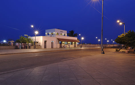
 Info created by Dey.sandip - uploaded by Dey.sandip - nominated by Dey.sandip -- Dey.sandip (talk) 12:38, 23 November 2012 (UTC)
 Support -- Dey.sandip (talk) 12:38, 23 November 2012 (UTC)
 Oppose bad crop (too tight at top, too large at bottom), moreover there is a lot of ghosts. --PierreSelim (talk) 13:56, 23 November 2012 (UTC)
- Oppose Bad crop (lantern), disturbing ghosts. Contrary to the widespread opinion in QI, I state that ghosts can stress the message of a photo. But in this case especially the ghosts on the street look like undefinied dust, single moving people are not visible at all. --Tuxyso (talk) 15:12, 23 November 2012 (UTC)
- Thanks. Where do you see a lantern? -- Dey.sandip (talk) 15:24, 23 November 2012 (UTC)
- See image notes. Sorry, in German "lantern" ("Laterne") is colloquial for street light. --Tuxyso (talk) 15:58, 23 November 2012 (UTC)
- Ok. About the ghosts, I still believe that it conveys the presence of moving people. There were about 50-100 people at least that must have crossed the sensor during the 16 second exposure. Post-processing and deghosting may be used to remove the portion you have annotated I don't have such softwares though. --07:07, 24 November 2012 (UTC)
- See image notes. Sorry, in German "lantern" ("Laterne") is colloquial for street light. --Tuxyso (talk) 15:58, 23 November 2012 (UTC)
- Thanks. Where do you see a lantern? -- Dey.sandip (talk) 15:24, 23 November 2012 (UTC)
 Neutral I like the colors, mood, and technical quality. The motion in still objective of the photo works for me on the left hand side, but on the right it becomes too much. Moreover the crop of the street lamp is unfortunate as pointed out already. --Slaunger (talk) 20:53, 23 November 2012 (UTC)
- The lamp post that you are saying as cropped was too tall (it was much taller than the other ones, you can say an aberration, but in reality that was how it was :)) and close to get into the frame. If it was included, there would be a lot of blue sky on the top which would be all negative space in a way. Right now, I think its still in balance. We do want to make everything perfect, but in reality there is sometimes no room to move, too many people to deal with. All that may not be evident from the photo though. --Dey.sandip (talk) 06:57, 24 November 2012 (UTC)
- Weak support The crop is unfortunate, but the colors and overall effect are great. Michael Barera (talk) 21:14, 23 November 2012 (UTC)
- Oppose Bad composition: one third of the image is an uninteresting foreground. Yann (talk) 08:25, 25 November 2012 (UTC)
 I withdraw my nomination