File:Study-flow.jpg

Original file (984 × 1,508 pixels, file size: 128 KB, MIME type: image/jpeg)
Captions
Captions

|
File:Study-flow.svg is a vector version of this file. It should be used in place of this JPG file when not inferior.
File:Study-flow.jpg → File:Study-flow.svg
For more information, see Help:SVG.
|
Summary[edit]
| DescriptionStudy-flow.jpg |
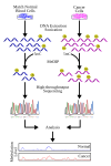
English: This is a workflow that demonstrates the general strategy in a MeDIP-seq experiment. Particularly, the example investigates cancer as a general source of disease condition; however, the starting source can range from different tissue types or different time points.
This diagram outlines, very briefly, the steps in MeDIP-seq including the use of software for aligning short reads depicted at the "High-throughput Sequencing" step. At the anlysis stage, a graph can be used to visualize and compare methylation levels between experimental sample (i.e. cancer/disease state, tissue-specific, time-specific, etc.) and the control (i.e. normal/blood cells, baseline time-point, normal tissue, etc.). The peaks show in the plot can essentially represent the frequency or short reads that have been aligned to the particular region in the genome. The more reads that cover a particular region, then the higher the methylation level. This can be explained by MeDIP having enriched for methylated DNA at this region. The plot and data in this diagram is entirely simulated and does not represent real MeDIP-seq data; this is to simply display typical visualization that can be used during MeDIP-seq analysis. |
| Date | |
| Source | Own work |
| Author | Gavinha |
| Other versions | Derivative works of this file: Study-flow (zh-cn).svg |
Licensing[edit]
| Public domainPublic domainfalsefalse |
| I, the copyright holder of this work, release this work into the public domain. This applies worldwide. In some countries this may not be legally possible; if so: I grant anyone the right to use this work for any purpose, without any conditions, unless such conditions are required by law. |
File history
Click on a date/time to view the file as it appeared at that time.
| Date/Time | Thumbnail | Dimensions | User | Comment | |
|---|---|---|---|---|---|
| current | 07:13, 3 March 2009 |  | 984 × 1,508 (128 KB) | Gavinha (talk | contribs) | Added x-axis |
| 06:07, 3 March 2009 |  | 984 × 1,508 (125 KB) | Gavinha (talk | contribs) | {{Information |Description={{en|1=This is a workflow that demonstrates the general strategy in a MeDIP-seq experiment. Particularly, the example investigates cancer as a general source of disease condition; however, the starting source can range from dif |
You cannot overwrite this file.
File usage on Commons
The following 2 pages use this file:
Metadata
This file contains additional information such as Exif metadata which may have been added by the digital camera, scanner, or software program used to create or digitize it. If the file has been modified from its original state, some details such as the timestamp may not fully reflect those of the original file. The timestamp is only as accurate as the clock in the camera, and it may be completely wrong.
| _error | 0 |
|---|
