Commons:Valued image candidates/Joseph Martin Kronheim - The Sunday at Home 1880 - Revelation 22-17.jpg

From Wikimedia Commons, the free media repository
Jump to navigation Jump to search

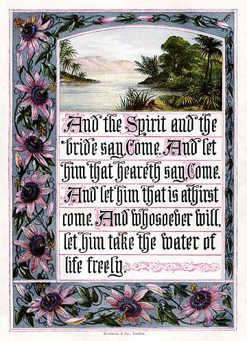
Joseph Martin Kronheim - The Sunday at Home 1880 - Revelation 22-17.jpg

promoted
Image
Nominated by Adam Cuerden (talk) on 2010-06-08 02:52 (UTC)
Scope Nominated as the most valued image on Commons within the scope:
Baxter process illustration
Used in Global usage
Reason A rather delicate work by Kronheim, with interesting use of colours and inks. Other possible scopes: Bridal theology, Baxter process. I don't think Revelation 22:17 merits a scope on its own, though. -- Adam Cuerden (talk)
Review
(criteria)
 Comment When I see a scope like this, I expect the image of a person (?) . Lycaon (talk) 06:28, 8 June 2010 (UTC)[reply]
Hmm. True. I'll switch the scope to Baxter process, although it's going to be hellish filling that category properly. Adam Cuerden (talk) 14:09, 8 June 2010 (UTC)[reply]
Well, I linked every Baxter process user I could find a category for to it. There's probably some uncategorised stuff I missed, but that's always true, isn't it? Adam Cuerden (talk) 15:01, 8 June 2010 (UTC)[reply]
With this scope it is reviewable ;-). Lycaon (talk) 15:03, 8 June 2010 (UTC)[reply]
 Request... I would suggest to reword it in the singular, however. --Myrabella (talk) 09:04, 9 June 2010 (UTC)[reply]
 Comment Difficult. What characteristics make an illustration printed with Baxter process recognizable at the VI review size, and different from another process?--Myrabella (talk) 09:04, 9 June 2010 (UTC)[reply]
It's mainly to do with the use of colours - the Baxter process allows some very delicate colours, such as the very pale periwinkle of the sky, and with the usage of non-standard inks like the silver (not that that shiny inks can really show up in a digitization. That sort of thing isn't easily reproducable with any of the other processes I can think of off-hand. In addition, of course, one can click on it to zoom in and note how the Baxter process allows different styles to be combined: The pale inks use a different style than the stipple engraving of the yellow, the black is line engraving, etc, etc. Adam Cuerden (talk) 05:03, 11 June 2010 (UTC)[reply]
  • With this explanation, I believe that characteristica are distinguishable in images for experienced viewers. Since some other examples have quality issues, I  Support this. --Ikar.us (talk) 10:43, 12 June 2010 (UTC)[reply]
Result: 1 support, 0 oppose =>
promoted. Lycaon (talk) 07:13, 15 June 2010 (UTC)
[reply]