Commons:Featured picture candidates/File:Taj Mahal, Agra, UP, India.jpg
Jump to navigation
Jump to search

Already acquired FP of Taj Mahal 
File:Taj Mahal, Agra, UP, India.jpg[edit]
Voting period is over. Please don't add any new votes.Voting period ends on 1 May 2012 at 18:17:49 (UTC)
Visit the nomination page to add or modify image notes.

 Info all by Yann (talk) 18:17, 22 April 2012 (UTC)

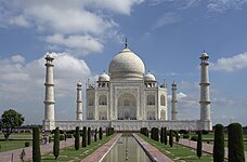
 Support A picture of the Taj Mahal with not too many tourists. Compared to the other FP, I see 2 good points: 1, no clouds; 2, the pond is not cut. Yann (talk) 18:17, 22 April 2012 (UTC)
- Support Tomer T (talk) 18:24, 22 April 2012 (UTC)
- Support Good anyway, I've just modified the levels a bit (hope that's alright). - A.Savin 19:49, 22 April 2012 (UTC)
- It is good for the highlights, but I would not do as much sharpening. Let's wait for other opinions. Yann (talk) 05:12, 23 April 2012 (UTC)
- Support Made a quick comparison with other images available; think this is the best. Jkadavoor (talk) 08:28, 23 April 2012 (UTC)
 Oppose this isn't an outstanding photo of the Taj Mahal. --kaʁstn Disk/Cat 12:33, 23 April 2012 (UTC)
- Oppose I have to agree with Carschten. Thumb looked 100% featurable. At full size I was disappointed. Sky is noisy, CAs on trees, artifacts, not very sharp on some points. --Paolo Costa (talk) 14:00, 23 April 2012 (UTC)
- Finally, I decided to revert the correction by A.Savin. Yann (talk) 15:55, 23 April 2012 (UTC)
- I actually like more the other sky, with white clouds. Also, this new one has magenta tint. The pond is better uncut, yes (even if the edge is still cut), but I would have bent a little lower to make it shorter - there's too much pond now imo. Can the pic be retaken from a lower angle? --Paolo Costa (talk) 17:01, 23 April 2012 (UTC)
- If taken from a lower angle, the trees will look too big, and hide the monument. There are many many tourists, and it is difficult to take a picture without them in the middle. Yann (talk) 15:09, 24 April 2012 (UTC)
- I actually like more the other sky, with white clouds. Also, this new one has magenta tint. The pond is better uncut, yes (even if the edge is still cut), but I would have bent a little lower to make it shorter - there's too much pond now imo. Can the pic be retaken from a lower angle? --Paolo Costa (talk) 17:01, 23 April 2012 (UTC)
- Finally, I decided to revert the correction by A.Savin. Yann (talk) 15:55, 23 April 2012 (UTC)
 Comment At least composition is much better than the current FP • Richard • [®] • 16:57, 23 April 2012 (UTC)
- Oppose Good composition, bad definition...--Telemaque MySon (talk) 17:04, 23 April 2012 (UTC)
- What do you mean by "bad definition"? Yann (talk) 15:09, 24 April 2012 (UTC)
![]() I withdraw my nomination Yann (talk) 17:21, 25 April 2012 (UTC)
I withdraw my nomination Yann (talk) 17:21, 25 April 2012 (UTC)