Commons:Featured picture candidates/File:Supercell.svg
Jump to navigation
Jump to search

File:Supercell.svg, featured[edit]
Voting period is over. Please don't add any new votes.Voting period ends on 2 Apr 2013 at 18:27:30 (UTC)
Visit the nomination page to add or modify image notes.

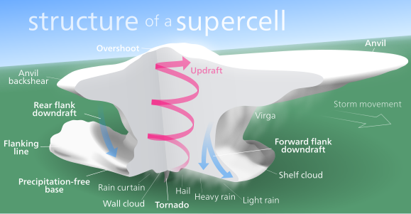
 Info Cutaway diagram of a supercell storm. All by Kelvinsong—Kelvinsong (talk) 18:27, 24 March 2013 (UTC)
 Support — Kelvinsong (talk) 18:27, 24 March 2013 (UTC)
- Support — Excellent work. -- Orionist ★ talk 02:55, 25 March 2013 (UTC)
- Support --Ximeg (talk) 10:23, 26 March 2013 (UTC)
 Oppose Excessive and unnecessary amount of effects, for some strange reason this seems an advertisement. On the other hand, low complexity --The Photographer (talk) 16:54, 26 March 2013 (UTC)
- Support - well done (it does look like this came out of an ad agency) —Mono 17:47, 26 March 2013 (UTC)
 Question—er, could someone please explain how it looks like an ad?—Kelvinsong (talk) 21:39, 26 March 2013 (UTC)
- OK, I'll try to explain: Why is the horizon (not sure if that's really supposed to be a horizon, but it looks like one) tilted? That doesn't make any sense to me. Why are some of the words smaller/less bold than others (e.g. "Virga" vs. "Anvil")? "Storm movement" is hard to read. "Anvil backshear" is hard to read on that (partly) nearly white background. Same thing with the "of a" in the heading. What purpose does that half transparent background of that heading have anyway? The whole heading is is imho the main reason it looks like an advertisement: In a scientific publication or textbook you would hardly ever find a heading/title within the illustration itself. Things like that always go into the descriptive text below the image ("Fig. 34: Anatomy of a Supercell. Some more detailed description following here.") – translated to Wikipedia that would be the descriptive text below the thumbnail. Sorry, but at the moment that's an Oppose per The Photographer. Don't get me wrong: The core graphics and the general idea have great potential, but there is just too much unnecessary stuff going on around that. --El Grafo (talk) 09:50, 27 March 2013 (UTC)
- I moved the Anvil backshear label, and increased the opacity of Storm movement. I reduced the tilt (though I don't like having the horizon perfectly horizontal). The reason for the different fontweights is to emphasize the important features—the "key" features of a supercell. The details on what kind of precipitation falls where is less important so I put is in a lighter fontweight. I put the heading there partly because its sister diagram (File:Hurricane-en.svg) also has the same style heading, and it makes it more "standalone"—if it comes up in a google image search, people will immediately know it's a supercell and not a regular thunderstorm or strange icecream sculpture. Regarding textbooks, it's not uncommon for the bigger, more important diagrams to have their own dedicated title—in my biology textbook, there's a large diagram of an animal and plant cell, and at the top it says "Animal Cell" and "Plant Cell" in big print.—Kelvinsong (talk) 13:03, 27 March 2013 (UTC)
- I see no problem with this, it looks nice and professional. —Mono 00:51, 31 March 2013 (UTC)
- OK, I'll try to explain: Why is the horizon (not sure if that's really supposed to be a horizon, but it looks like one) tilted? That doesn't make any sense to me. Why are some of the words smaller/less bold than others (e.g. "Virga" vs. "Anvil")? "Storm movement" is hard to read. "Anvil backshear" is hard to read on that (partly) nearly white background. Same thing with the "of a" in the heading. What purpose does that half transparent background of that heading have anyway? The whole heading is is imho the main reason it looks like an advertisement: In a scientific publication or textbook you would hardly ever find a heading/title within the illustration itself. Things like that always go into the descriptive text below the image ("Fig. 34: Anatomy of a Supercell. Some more detailed description following here.") – translated to Wikipedia that would be the descriptive text below the thumbnail. Sorry, but at the moment that's an
- Support --Michael Gäbler (talk) 21:47, 30 March 2013 (UTC)
- Support --Karelj (talk) 16:05, 31 March 2013 (UTC)
- Support May be a matter of taste but I think it looks nice, it's well done and useful. --Ximonic (talk) 19:01, 1 April 2013 (UTC)
Confirmed results:
Result: 7 support, 2 oppose, 0 neutral → featured. /George Chernilevsky talk 04:42, 3 April 2013 (UTC)
This image will be added to the FP gallery: Non-photographic media/Computer-generated