Commons:Featured picture candidates/File:Helgoland - Blick vom Lummenfelsen zur Langen Anna.jpg
Jump to navigation
Jump to search

File:Helgoland - Blick vom Lummenfelsen zur Langen Anna.jpg, featured[edit]
Voting period is over. Please don't add any new votes.Voting period ends on 25 Jun 2019 at 09:31:01 (UTC)
Visit the nomination page to add or modify image notes.

- Category: Commons:Featured pictures/Places/Natural/Germany
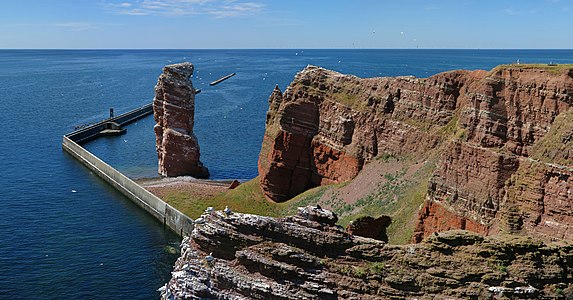
 Info View from the "Lummenfelsen" called rock on the island of Heligoland to the Lange Anna. All by me. -- Milseburg (talk) 09:31, 16 June 2019 (UTC)
 Support -- Milseburg (talk) 09:31, 16 June 2019 (UTC)
 Comment maybe a bit underexposed? --Martin Falbisoner (talk) 11:05, 16 June 2019 (UTC)
- Support I like it, interesting scene and good composition. Cmao20 (talk) 12:59, 16 June 2019 (UTC)
 Oppose The midsummer 2PM lighting causes shadows to appear where you don't want them to appear, and the lit portions to be less vibrant than ideal. Also plenty of blown whites at the bottom. -- King of ♥ ♦ ♣ ♠ 14:25, 16 June 2019 (UTC)
- Support Fine shot . --Palauenc05 (talk) 16:35, 16 June 2019 (UTC)
- Support - Good, interesting composition, and extremely well-executed as usual. I have no problem with the shadows. Blown whites (bird excrement, I believe), if indeed blown, are minimal in context. -- Ikan Kekek (talk) 20:25, 16 June 2019 (UTC)
- Oppose Good quality but the lighting could have been more pleasant, sorry --A.Savin 23:54, 16 June 2019 (UTC)
- Comment - You have a good point. Your photo is better. Why don't you nominate it? -- Ikan Kekek (talk) 04:41, 17 June 2019 (UTC)
- I had nominated a similar picture, but it failed. --A.Savin 10:09, 17 June 2019 (UTC)
- Because it´s oversaturated. --Milseburg (talk) 13:01, 17 June 2019 (UTC)
- I for myself have a rather low tolerance for overdone saturation, normally I take the green of the grass and/or the blue of the sky as reference and reduce the level. But whereas it is easy to reduce the whole saturation or chosen channels at any time afterwards, you cannot add much more light to your picture when you have taken it in weak light, and the beauty of Heligoland cliffs (including the colours) is only seen entirely when it is sufficiently lit. Anyone who juxtapose both picture see the difference immediately. Your picture may be correctly saturated, but the colours that I would like to see are definitely lost there. --A.Savin 13:35, 17 June 2019 (UTC)
- Support -- Eatcha (talk) 03:24, 17 June 2019 (UTC)
- Oppose Bad light. -- -donald- (talk) 07:35, 17 June 2019 (UTC)
- Support --Uoaei1 (talk) 08:31, 17 June 2019 (UTC)
- Support--Agnes Monkelbaan (talk) 09:51, 17 June 2019 (UTC)
- Oppose per KoH and A.Savin – Lucas 12:51, 17 June 2019 (UTC)
- Comment I can spend more light to the shadows if wanted, but I think in general shadows give more vividness to the relief as everywhere the same lighting. --Milseburg (talk) 13:01, 17 June 2019 (UTC)
- Shadows of course add dimensionality - if they are in the right direction. Here the shadows go straight down unfortunately, making the scene look flat to me. -- King of ♥ ♦ ♣ ♠ 14:58, 17 June 2019 (UTC)
- Support --Boothsift 03:55, 19 June 2019 (UTC)
- Support Since I !voted for A. Savin's picture that didn't pass, I will say that this is just as good. Daniel Case (talk) 04:17, 19 June 2019 (UTC)
- Oppose It's a surprisingly nice image to view at 100% zoom and scroll around, but if viewed as a whole it doesn't really convince me. --El Grafo (talk) 15:14, 19 June 2019 (UTC)
- Support.--Vulphere 08:39, 20 June 2019 (UTC)
Confirmed results:
Result: 10 support, 5 oppose, 0 neutral → featured. /--A.Savin 13:12, 25 June 2019 (UTC)
This image will be added to the FP gallery: Places/Natural/Germany